
Mastering The Crypto Cycle Chart
Unlock the secrets of the crypto cycle chart. Learn to identify market phases, read key indicators, and make smarter investment decisions with our expert guide.
Ever looked at a crypto chart and felt like you were staring at random, chaotic squiggles? It's a common feeling. But what if there was a hidden pattern, a predictable rhythm to the madness? That’s exactly what a crypto cycle chart helps you see.
Think of it as a roadmap for the market's emotional and financial journey. Instead of getting lost in the day-to-day noise of price spikes and dips, this chart reveals the bigger picture—a repeating story of how markets behave. It’s a lot like the four seasons; each phase has its own distinct feel, letting you know what to expect next.
What Is a Crypto Cycle Chart?
A crypto cycle chart is a visual representation of the recurring patterns that assets like Bitcoin have historically followed. These cycles aren't random. They're driven by a powerful mix of fundamental factors, like token supply, and the deeply ingrained tides of human psychology—our collective fear and greed.
Just like nature has its seasons, financial markets have their phases. A cycle chart helps you identify which "season" you're in right now.
This is a powerful perspective shift. You move from reacting to daily price action to understanding the overarching trend. It gives you the high-level view needed to see where the market has been and, more importantly, where it might be headed. Armed with this knowledge, you can make smarter, more strategic decisions and avoid classic emotional blunders like FOMO-buying the top or panic-selling the bottom.
The Four Core Phases
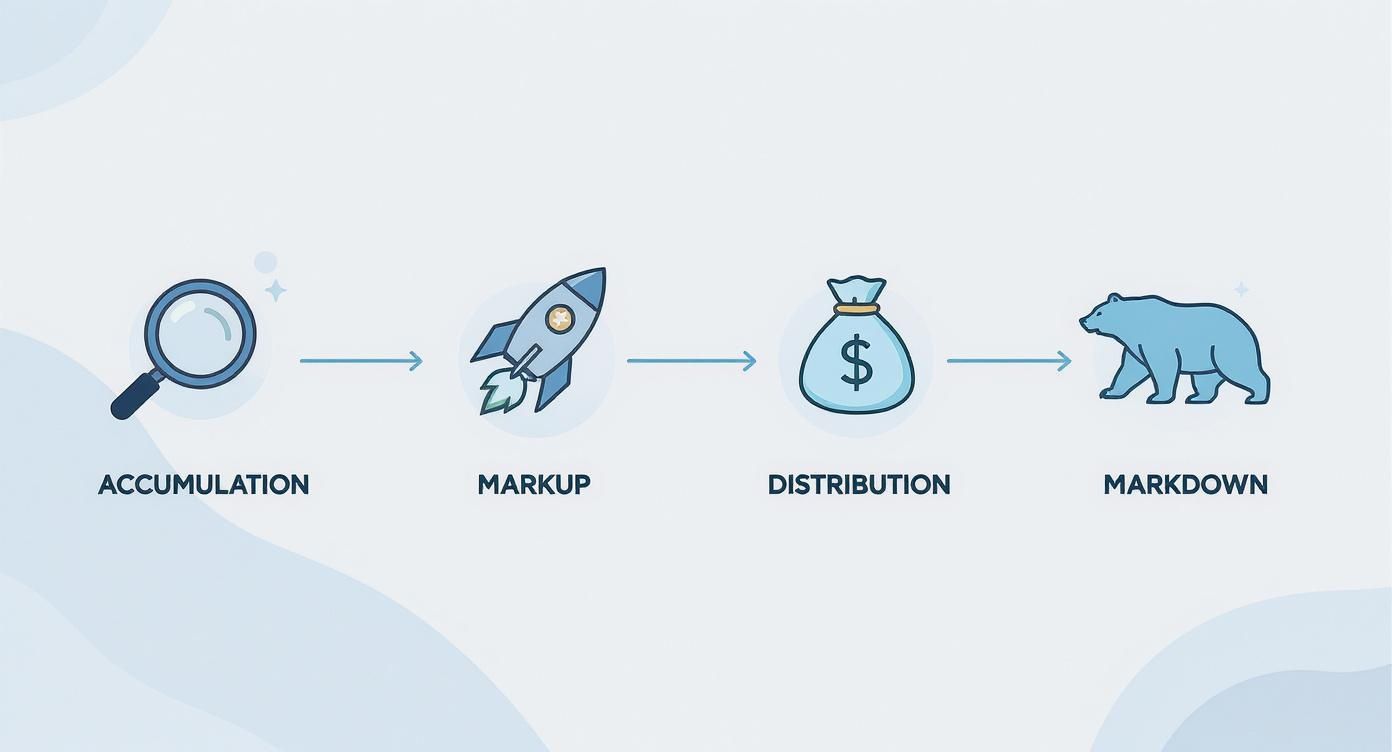
At its heart, the crypto cycle is broken down into four distinct phases that follow one another in a sequence. Understanding these is the first step to making sense of it all.
- Accumulation: The quiet after the storm. The last market crash has left sentiment in the gutter, prices are flatlining, and most people have written crypto off. This is when smart, patient investors start quietly buying, or "accumulating," assets while they're cheap.
- Markup: Life returns to the market. As prices slowly grind upward, early adopters and then the broader public take notice. Optimism builds, kicking off a period of strong growth that can eventually turn into a full-blown, parabolic bull run.
- Distribution: Peak euphoria. Prices are hitting new all-time highs, and it feels like the party will never end. This is when the smart money that bought during accumulation begins to sell, or "distribute," their bags to the wave of excited new buyers.
- Markdown: The music stops. Selling pressure overwhelms buying demand, and the market turns over. Prices start a steady, often brutal, decline that triggers panic and a crash, ultimately paving the way for the next accumulation phase.
The crypto market cycle is a story of sentiment shifting from fear to greed and back to fear again. The chart is the illustration of that story, providing clues at each chapter.
This framework isn't just theory; it's a reflection of how capital and emotion flow through a market.
To make it even clearer, here’s a quick snapshot of what to look for in each phase.
The Four Phases of a Crypto Market Cycle at a Glance
This table gives you a quick summary of the key characteristics of each phase. It helps you identify where we are in the cycle based on price, sentiment, and the overall mood of the market.
Each of the four cycle phases has a distinct personality — a recognizable combination of price behavior, market mood, and the emotional state driving the average investor's decisions. Learning to read all three signals together is what makes phase identification reliable rather than guesswork.
Accumulation is the quietest phase and the hardest to act on emotionally. Price moves sideways in a flat range with no meaningful direction, often for months. The broader market sentiment is bearish bordering on indifferent — most participants have simply stopped paying attention. The investor psychology underlying that indifference is deeper than it looks: it is a mix of genuine despair from those who held through the prior crash and active disbelief from anyone considering re-entry. The combination of flat price and negative sentiment is precisely what makes accumulation the phase of maximum financial opportunity and minimum psychological comfort.
The markup phase feels like the market waking up after a long sleep. Price shifts into a clear uptrend, and the sentiment that was buried in bearishness begins its slow recovery toward optimism. What makes this phase psychologically distinctive is the progression of emotional states that carry it forward. It begins with hope — a tentative sense that things might be turning around — then builds through excitement as the trend becomes undeniable, and eventually tips into the kind of thrill that starts pulling in participants who have been watching from the sidelines. That emotional progression is what fuels the feedback loop of rising prices and growing participation.
Distribution is the most deceptive phase because the surface reading and the underlying reality point in opposite directions. Price action is volatile and choppy, making new highs but with an unstable, topping-out quality. The prevailing sentiment is mixed and increasingly uncertain, though many participants cannot yet see through the noise. The investor psychology at the peak of this phase is a tension between euphoria — a genuine conviction that prices will keep climbing — and a quiet, growing anxiety that something may be changing. Smart money is selling into that euphoria. The gap between how the market feels and what is actually happening is wider during distribution than at any other point in the cycle.
Markdown is where the psychological damage accumulates. Price enters a sharp, sustained downtrend with little relief. Sentiment turns decisively bearish, and as losses mount, fear dominates the conversation. The emotional arc of markdown runs from fear through anger — directed at the market, at specific projects, at the broader concept of crypto — and eventually reaches capitulation: the exhausted acceptance that drives the final wave of selling that clears the market and sets the stage for accumulation to begin again.
Once you internalize this structure, the crypto cycle chart stops being some complex analytical tool and starts feeling more like an intuitive map. It gives you the context you need to navigate the volatility, manage your risk, and spot much better opportunities to enter and exit your positions.
Navigating The Four Market Cycle Phases
Knowing the theory behind a crypto cycle chart is one thing, but actually seeing it play out in real-time is a completely different ballgame. Every cycle has four distinct phases, each with its own personality driven by the collective mood of millions of investors. Once you learn to spot the unique price action, trading volume, and market sentiment of each stage, you can turn a chaotic chart into a clear story.
This diagram gives you a great visual for how the four phases flow from one to the next in a never-ending loop.
Start tracking smart money today
Join thousands of traders using WalletFinder.ai to find profitable wallets and copy their trades.
Start Free Trial →

