
Master Candlestick Chart Google Sheets for Crypto
Candlestick chart google sheets - Learn to create a powerful candlestick chart google sheets for crypto analysis. This guide covers OHLC data, automation, and a
You’re watching a token rip on one screen, a wallet feed on another, and a charting platform on a third. By the time you line up price action with wallet entries, the move is already extended.
This is why traders end up building a candlestick chart google sheets workflow. It’s not because Sheets is glamorous. It’s because a spreadsheet can become the one place where raw crypto data, wallet exports, and chart logic all live together.
Generic tutorials usually stop at stock examples and manual data entry. Crypto trading doesn’t work that way. You need price structure that updates, a chart you can reshape fast, and a setup that helps you compare what wallets did against what the market printed.
Why Your Trading Workflow Needs a Custom Chart
A fast crypto trade rarely breaks because the idea was bad. It usually breaks because the workflow was slow.
You spot a wallet accumulation on one tab, check price on another, then flip to a chart to see whether the move already stretched. That delay is enough to turn a clean entry into a chase. In crypto, especially around low-float tokens and fast Solana rotations, the market often moves before you finish cross-checking your tools.
A custom Google Sheets chart fixes that workflow problem by putting price structure beside the data that drives your decisions. Instead of treating charting, wallet activity, and notes as separate tasks, you can view them in one place and judge the setup faster.
That changes the quality of the trade.
A line chart only shows the closing path. A candlestick chart shows the open, high, low, and close for each interval, so you can see whether buyers held the close, whether sellers forced a wick rejection, and whether volatility expanded right where smart money entered. Those details matter when you are comparing a wallet buy from Wallet Finder.ai with the candle that printed around it.
Crypto makes this more useful than generic spreadsheet tutorials admit. Stock examples often assume delayed or static data, clean market hours, and one exchange feed. Crypto trades around the clock, price can differ across venues, and token data from APIs often arrives messy. Building your own chart in Sheets gives you control over timeframe, source, and annotations, which is exactly what you need if you want to line up wallet behavior with real market structure instead of reading them in isolation.
I use custom Sheets charts for one reason. They reduce interpretation lag.
If a tracked wallet buys into a breakout candle that closes near the high, that means something different from a wallet buy that lands after a long upper wick and weak close. Both are buys. Only one gives a cleaner read on momentum. A custom chart helps you catch that distinction before the trade is gone.
If you want a crypto-specific primer before building your own system, this guide to a candlestick chart for cryptocurrency gives useful context.
Sourcing and Structuring Your Crypto OHLC Data
The chart only works if the table is clean. Most broken candlestick charts in Sheets come from bad structure, not bad chart settings.
Crypto makes this worse because data often arrives from APIs, CSV exports, scraped pages, or copied exchange tables. Each source names columns differently, timestamps differently, and sometimes flips high and low if you’re not careful.
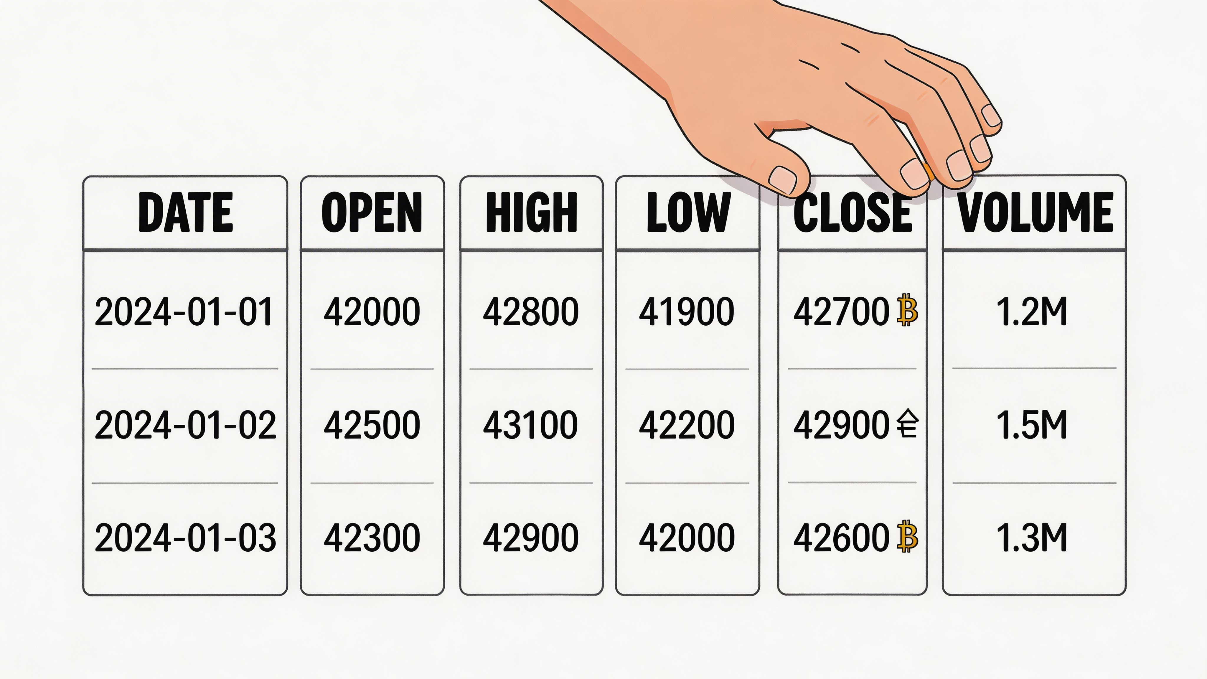
Use the exact structure Google Sheets expects
A standard setup uses five columns:
| Column | What goes in it |
|---|---|
| A | Date |
| B | Open |
| C | High |
| D | Low |
| E | Close |
Start tracking smart money today
Join thousands of traders using WalletFinder.ai to find profitable wallets and copy their trades.
Start Free Trial →

