
Blockchain Data Visualization: A Trader's Guide to Alpha
Unlock alpha with blockchain data visualization. This guide explains how to turn raw on-chain data into actionable trading signals for DeFi and copy trading.
You're probably doing some version of the same routine most DeFi traders do when they get serious. One tab has Etherscan or Solscan open. Another has a token chart. A third has a wallet you suspect is worth following. Then you start clicking through swaps, approvals, bridges, LP positions, and transfer histories, trying to answer one simple question.
What is this wallet doing?
That's where blockchain data visualization stops being a nice feature and starts becoming a trading tool. Good visuals compress noisy on-chain history into something you can act on. They help you see whether a wallet is accumulating, rotating, distributing, bridging, or just farming attention. For copy traders and smart money hunters, that difference matters.
From Raw Data to Trading Alpha
Block explorers are useful for verification. They're bad at pattern recognition.
A single transaction page can tell you what happened in one block. It usually can't tell you whether the same wallet has been building a position for days, whether several related wallets are moving together, or whether funds came from a CEX before a coordinated buy. Traders lose time because they're forced to reconstruct a story from fragments.
That's the practical problem blockchain data visualization solves. It turns wallet activity into sequences, clusters, flows, and timelines. Instead of reading raw logs, you start seeing behavior.
What raw explorer work misses
A trader looking at a memecoin or early DeFi launch usually wants answers to a short list of questions:
- Who bought first: Did known profitable wallets enter before the crowd?
- Where funds came from: Was capital bridged in, withdrawn from an exchange, or rotated from another token?
- How conviction looks: Is the wallet scaling in, taking one-shot exposure, or trimming into strength?
- Whether activity is isolated: Is one wallet moving, or is a cluster of related wallets doing the same thing?
Those questions are hard to answer in raw tables. They become much easier when the data is visual.
Practical rule: If you can't explain a wallet's behavior in one sentence after five minutes of review, you don't need more tabs. You need a better visual model.
The edge isn't that visuals look cleaner. The edge is speed. In active markets, the trader who identifies a wallet pattern first gets the better entry, the cleaner copy trade, or the earlier exit.
That's also why serious on-chain work now sits closer to analytics than to casual blockchain browsing. If you want a broader foundation for how this stack works, this guide to blockchain data analytics is a useful companion to the trading side.
What alpha looks like in visual form
The best setups often start as simple visual cues:
- A repeated buyer appears across multiple winning launches
- Several wallets fund from the same source and buy within a tight window
- A wallet that usually scales out slowly exits much faster than normal
- DEX activity spikes, but only a small holder cluster is driving it
Those are not “charting” insights in the usual sense. They're behavior insights. Blockchain data visualization gives you a way to see them before they're obvious from price alone.
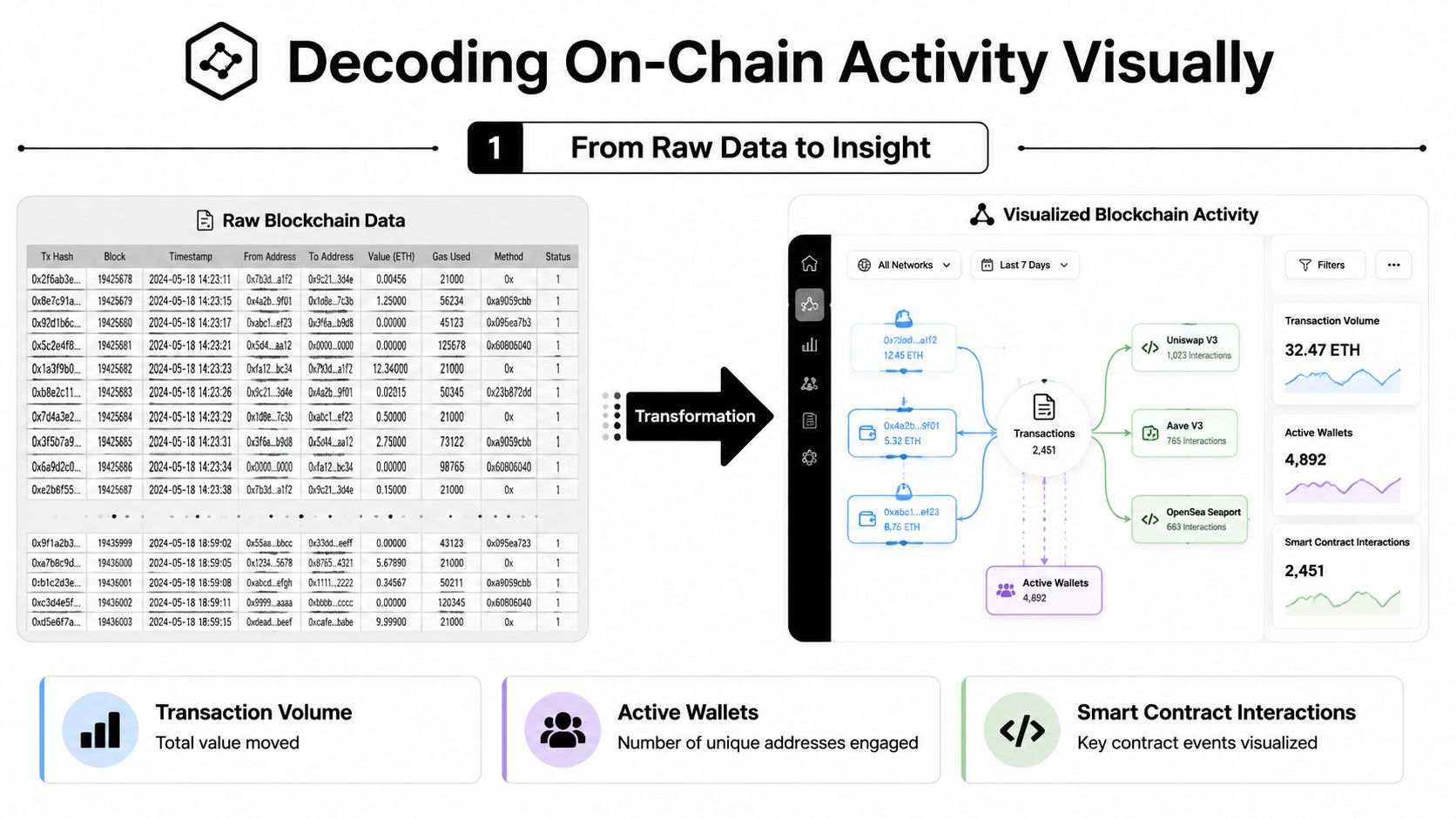
Decoding On-Chain Activity Visually
Think of raw blockchain data as a giant spreadsheet where every row is technically important and almost none of it is immediately readable. You have addresses, timestamps, token amounts, contract calls, approvals, pool interactions, and transfers. Everything is there. Very little is clear.
Visualization is what turns that spreadsheet into a usable trading interface.
Start tracking smart money today
Join thousands of traders using WalletFinder.ai to find profitable wallets and copy their trades.
Start Free Trial →

