
Download Phantom Wallet: A 2026 Secure Setup Guide
Learn how to safely download Phantom Wallet for desktop and mobile. Our 2026 guide covers secure installation, seed phrase safety, and avoiding common scams.

May 7, 2026


Wallet Finder
March 8, 2026

The Smart Money Index (SMI) is a classic technical indicator designed to track what the pros are doing. It’s built on a simple premise: the seasoned, institutional investors—the "smart money"—tend to make their moves late in the trading day, while the early morning flurry is often driven by emotional retail traders reacting to overnight headlines.
Think of it like a high-stakes poker game. On one side, you have the professional players who wait patiently, study their opponents, and only place big bets when the odds are firmly in their favor. On the other side, you have the tourists, going all-in on a gut feeling. The SMI is designed to follow the pros, not the tourists.
This indicator works by filtering out the "noise" from the market open. The first hour is often a chaotic mix of overnight news reactions, amateur jitters, and knee-jerk decisions. The SMI effectively ignores this and instead focuses heavily on the final hour of trading.
The idea is that institutional investors and professional traders use the end of the day to strategically position their massive portfolios. They've watched the entire day's price action unfold and can now make calculated, informed decisions.
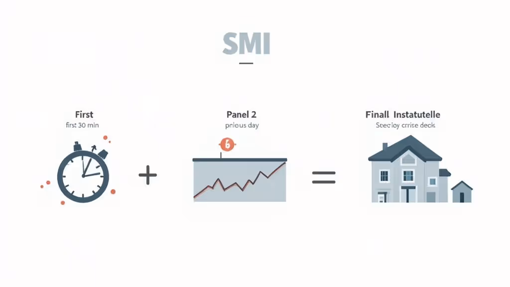
Popularized by money manager Don Hays in the 1980s, the Smart Money Index really caught on after being featured in a 1988 Barron's article. It’s traditionally calculated using the Dow Jones Industrial Average (DJIA). The formula is pretty intuitive: it subtracts the market's performance in the first 30 minutes of trading and adds back the performance from the final hour. You can dig into the full history and calculation on Wikipedia.
By isolating these specific windows, the SMI tries to uncover the true sentiment of the market's most influential players.
Actionable Signals from the SMI:
A core principle of the Smart Money Index is that divergence is a powerful signal. When the overall market is making new highs but the SMI is trending down, it suggests that informed investors are losing confidence, often preceding a market downturn.
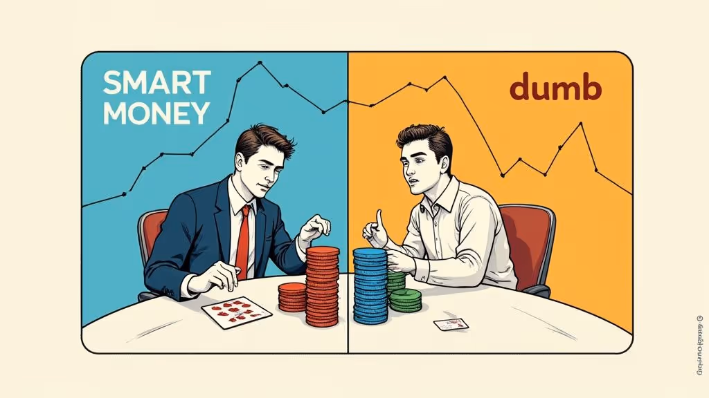
To really get why the SMI matters, you have to understand the two groups it tries to separate. "Smart money" and "dumb money" aren't insults; they're just industry shorthand for two very different trading psychologies. In short, smart money acts with a plan, while dumb money reacts to the latest headline.
This table breaks down the key behavioral differences that the SMI is built to identify.
CharacteristicSmart Money (Informed)Dumb Money (Reactive)Trading TimePrimarily active in the final hour of trading to execute large, planned orders.Most active at the market open, reacting to overnight news and emotion.Decision DriverBased on in-depth analysis, fundamental data, and long-term strategy.Driven by fear, greed, hype, and media headlines (FOMO and FUD).Market ImpactTends to buy into weakness and sell into strength, acting as a contrarian force.Often buys at market tops and panic-sells at market bottoms.IndicatorsLarge, calculated transactions; accumulation during downturns; distribution during rallies.High trading volume during volatile news events; chasing fast-moving trends.
Understanding this distinction is the key to unlocking market dynamics. It's the very foundation the Smart Money Index is built on, helping traders see past the surface-level noise and tune into what the big players are actually doing.
Understanding the theory is great, but getting your hands dirty with the calculation is what really makes the Smart Money Index click. The formula itself isn't some complex piece of financial engineering. It's actually quite simple, designed with one goal in mind: to filter out the emotional, retail-driven noise from the market open and zero in on the deliberate, calculated moves made at the close.
Think of it less as a daily snapshot and more as a running tally of smart money sentiment. Each day's calculation builds on the last, which is why you can plot the SMI as a continuous line on a chart, much like a moving average. It tells a story over time.
The calculation for the Smart Money Index boils down to three key pieces. When you put them together, you get a single number that reflects the net impact of professional trading for that day.
Here's a step-by-step breakdown of how it works:
The Formula in Action:
Today's SMI = Yesterday's SMI - (Market Gain/Loss in First 30 Minutes) + (Market Gain/Loss in Final Hour)
This structure is intentional. It punishes the index for those early-morning rallies that often trap retail traders and rewards it for strength into the close, which is typically seen as strategic buying by bigger players.
Let's walk through a quick scenario to see this in action. We'll use the Dow Jones Industrial Average (DJIA) for our example.
VariableValueDescriptionPrevious Day's SMI Close15,000This is our starting line.First 30-Minute Change+75 pointsThe DJIA popped right at the opening bell.Final Hour Change-25 pointsThe market faded and sold off into the close.
Plugging these numbers into the formula:
See what happened? Even if the DJIA finished the day positive overall, the SMI dropped. This is a classic bearish divergence, signaling that the "smart money" was likely using that early morning pop as an opportunity to sell to the crowd.
Of course, the original concept has been tweaked over the years. One of the most popular modern versions is the Smart Money Flow Index (SMFI), which was developed back in 1997 to get an even more precise read on institutional activity.
While it's built on the same core idea, the SMFI uses a proprietary formula that weighs intra-day price action a bit differently. This often leads to different, sometimes earlier, signals. Some traders swear by it, calling it one of Wall Street's "best kept secrets" for nailing market tops and bottoms. You can dive deeper into how the SMFI stacks up against traditional indices on wallstreet-online.de.
The classic Smart Money Index was built for a world with opening and closing bells. It works by looking at two specific windows of time—the first 30 minutes and the final hour of trading—to guess what the pros are doing versus the amateurs.
But what happens when the market never sleeps? The 24/7 chaos of crypto makes a direct, time-based SMI totally unworkable.
The good news is, the core idea behind the index is more powerful than ever in crypto. We just have to switch our thinking. Instead of asking when smart money is trading, we need to ask what they're doing on-chain. This is where on-chain data becomes our new, crypto-native SMI.
Because blockchains are transparent, we get a front-row seat to the action. We can see exactly when big players are stacking sats, selling off, or just holding tight. These on-chain metrics give us the same kind of institutional sentiment the original SMI was designed to capture, but with far more clarity. For a closer look at interpreting these patterns, On Chain Analysis: A Trader's Ultimate Guide explains the key strategies step by step.
To create a crypto-friendly version of the SMI, we're swapping intraday timing for on-chain flows and balances. A few key metrics are fantastic proxies for tracking the moves of whales, funds, and seasoned traders.
Think of these signals as a real-time pulse check on market conviction:
When you start combining these data points, you get a powerful picture of smart money behavior. A sustained outflow of crypto from exchanges plus a rising stablecoin supply is one of the strongest signals out there that the pros are getting ready for a major move up.
You don't need to be a blockchain wizard to get your hands on this information. Plenty of on-chain analytics platforms have user-friendly dashboards that chart these metrics out for you.
When you're looking at this data, remember that context is king. A single massive transaction is just noise. What you're looking for is a persistent trend unfolding over days or weeks—that's the real signal. To learn more, check out our guide on how to track smart money across blockchains.
This whole approach brings the spirit of the Smart Money Index into the modern era. We're replacing the rigid time rules of old-school markets with the fluid, transparent data streams of the blockchain, giving any trader the ability to follow the footprints of the market's biggest players.
Turning raw on-chain data into trading signals you can actually use is where the magic happens. The old-school Smart Money Index was all about market timing, but its crypto cousin is built on spotting patterns in blockchain activity.
The two most important patterns you need to master are divergence and confirmation.
Think of divergence as a red flag. It’s when an asset's price and smart money activity start moving in opposite directions, hinting that the current trend is losing momentum. Confirmation is the opposite—it’s when on-chain data backs up the price trend, giving you confidence that the move has real conviction behind it.
Learning to spot divergence is like learning to read the market's body language. It tells you what the big players are really doing, not just what the price chart says.
Here are actionable examples:
A key takeaway is that price can be misleading on its own. Divergence provides crucial context, showing whether the market's biggest players agree with the current price action.
This decision tree helps visualize how the core logic of the Smart Money Index is adapted for traditional versus crypto markets based on their fundamental operating hours.
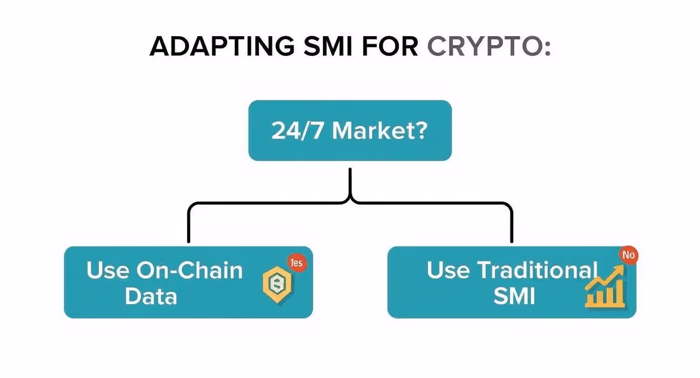
The visualization clarifies that because crypto markets are always on, traders must shift from time-based analysis to on-chain data to track smart money effectively.
To make this practical, you need a clear framework for interpreting these signals. Think of them as building blocks for your analysis; when multiple signs point in the same direction, your trading thesis gets a lot stronger. Tracking these patterns is foundational, and you can learn more about how to track entry and exit signals from DeFi wallets in our detailed guide.
Here's a quick-reference guide to help you translate common on-chain signals into potential trading actions.
On-Chain SignalWhat It IndicatesPotential Trading ActionSustained Negative Exchange NetflowLong-term holders are moving coins to cold storage, reducing available supply.Bullish. Consider this a sign of accumulation and potential long entries.Spike in Exchange InflowLarge holders are moving coins to exchanges, likely preparing to sell.Bearish. This could signal an upcoming sell-off; consider taking profits.Rising Stablecoin Supply on ExchangesBuying power (dry powder) is increasing on the sidelines.Bullish. Suggests capital is ready to deploy, fueling a potential rally.Large Whale Wallet AccumulationThe biggest market players are increasing their holdings, often during price dips.Bullish. A strong sign of conviction from those with the most capital.
This table serves as a solid starting point for reading the on-chain tea leaves.
Of course, no indicator is foolproof. A huge curveball in crypto is the derivatives market. A massive cascade of futures liquidations can force a ton of spot selling or buying in a very short time.
This can create a huge spike in exchange flows that looks like a strategic move by smart money but is really just forced deleveraging. It's noise, not a signal.
That’s why you always need to cross-reference what you’re seeing. If you spot a large inflow to exchanges, take a second to check the open interest on futures markets. If it just collapsed, that inflow is probably just fallout from liquidations, not a calculated move by long-term holders.
While the Smart Money Index and its on-chain cousins are powerful tools, they’re not crystal balls. Far from it. Relying on these signals alone, without understanding their limits, is a fast track to some painful trading mistakes.
The biggest mistake I see traders make is treating the SMI like a precision timing tool. It’s not. It’s a sentiment gauge.
The SMI is designed to show you the direction institutional capital is flowing, not the exact moment to click “buy” or “sell.” For instance, a bearish divergence can brew for weeks before a market top finally rolls over. If you jump the gun on that initial signal, you could get steamrolled as the trend squeezes out one last rally.
Another trap is getting blindsided by major news. In crypto, where markets pivot on a dime based on headlines, even the smartest money gets caught off guard. A sudden regulatory crackdown or a major protocol hack can trigger a panic sell-off that makes any underlying accumulation signal totally irrelevant for a while.
Perhaps the most dangerous pitfall is looking at smart money signals in a vacuum. A divergence pattern is a clue, not a conclusion. By itself, it’s just noise—an interesting observation without any real weight.
Key Insight: A smart money signal should be the start of your analysis, not the end of it. It’s a prompt to dig deeper and ask why the big players might be making a move and what other market factors back up that theory.
To stay out of this trap, you absolutely have to seek confirmation from other indicators. Think of it as building a case for your trade. Here are a few essential cross-checks:
On-chain data is incredibly insightful, but it doesn't exist in a bubble. Major macroeconomic shifts can easily overpower whatever is happening inside the crypto ecosystem, making even the strongest signals temporarily useless. Changes in interest rate policy, new inflation data, or geopolitical events can cause massive capital rotations across every asset class.
This is where the original idea behind the smart money index reflects that bigger, long-term institutional thinking. Historically, major peaks in stock valuations, like during the 2000 tech bubble, were followed by sharp rotations into assets like gold. After 2000, gold went on a tear from around $250/ounce to $1,900/ounce. That was a crystal-clear signal of "smart money" moving from overhyped equities to hard assets to hedge against the coming storm. Understanding these broader capital shifts on montinvest.com gives you crucial context for what you're seeing on-chain today.
A smart money signal might scream accumulation in crypto, but if the Federal Reserve is signaling aggressive rate hikes, institutional capital might just flee all risk assets—including crypto. Always zoom out and look at the big picture before you put your capital on the line.
Let's be real: trying to manually track the smart money index by digging through on-chain data is a nightmare. It's a slow, painstaking process of sifting through blockchain explorers and trying to connect the dots between thousands of transactions. It takes serious time and effort.
This is exactly why specialized tools exist—to cut through the noise and translate raw, messy data into clean, actionable signals.
Wallet Finder is built to automate this entire workflow. Think of it as a powerful lens that filters out the market chatter, letting you zero in on the high-conviction trades made by top-performing wallets. Instead of just guessing who the "smart" players are, the platform points you directly to them using hard data like PnL and win rates.
The first, most crucial step is finding the right wallets to follow in the first place. Wallet Finder's core is its discovery engine, which is designed to surface "alpha" wallets based on their verifiable, on-chain trading history. This lets you move past theory and start tracking traders with a proven record of success.
The process is pretty straightforward:
Finding a smart wallet is only half the battle. You need to know when they make a move, and you need to know instantly. This is where automated alerts are a game-changer. After adding a wallet to your watchlist, you can set up instant notifications for any important on-chain activity.
Here’s the key advantage: speed. By the time a huge transaction gets posted and discussed on social media, the alpha is usually long gone. Automated alerts let you see the move the second it happens on-chain, giving you a chance to act before the herd arrives.
For example, you can get a Telegram ping the moment a tracked wallet buys into a new token launch or finally sells a position they've been holding for months. This completely flips your strategy from being reactive to proactive, allowing you to mirror winning trades with precision.
You can get a better feel for the platform’s capabilities by checking out the features on the official Wallet Finder.ai website.
The screenshot below gives you a glimpse of the platform’s dashboard, where you can discover and analyze these top-performing wallets.
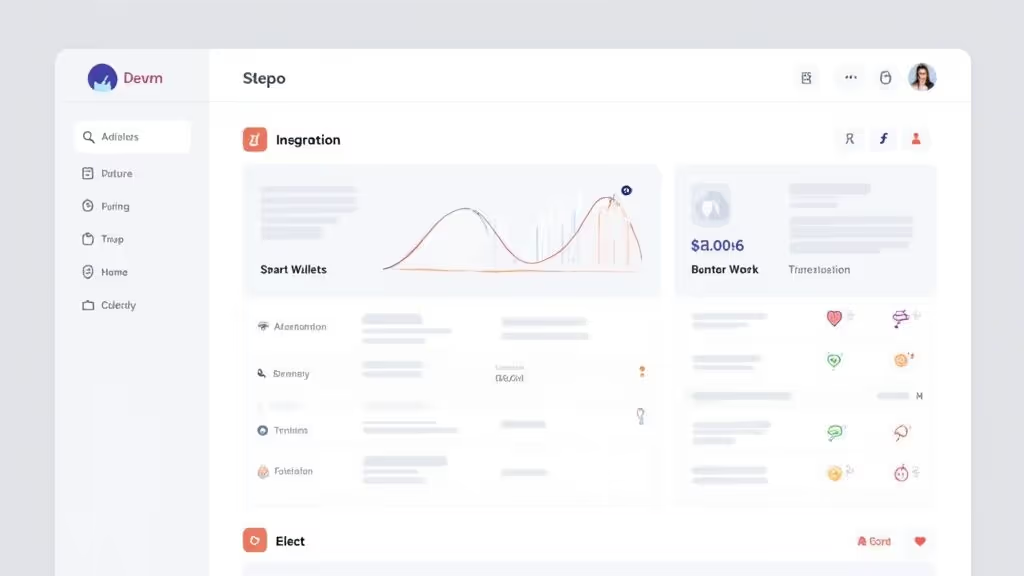
This view gives you a clean snapshot of a wallet’s profitability, win rate, and most-traded tokens, making it simple to spot traders who are consistently getting it right.
Let's walk through a real-world example. Say you want to get an edge during a new token launch—an event that’s notoriously chaotic and volatile.
This is how you put the theory of the smart money index into practice. It's about moving beyond vague market sentiment and focusing on the specific, verifiable actions of the most profitable players in crypto.
Understanding that smart money is accumulating on-chain is half the battle. The other half is understanding how smart money enters and exits positions on the price chart itself. This is the domain of Smart Money Concepts (SMC) — a chart-reading methodology built around the premise that large institutional players engineer specific price movements to fill their orders efficiently, and that these movements leave identifiable fingerprints in the price action.
SMC is not a new set of indicators drawn on top of a chart. It is a different way of reading what price is doing and why. Where a retail trader sees a breakout, an SMC practitioner sees a liquidity sweep designed to trigger stop-losses and fill a large institutional buy order at a discounted price. Where a retail trader sees a support bounce, an SMC practitioner sees price returning to an order block — a specific candle or zone where institutional accumulation or distribution previously occurred. Learning to read these patterns gives you a map of where smart money is likely to enter, hold, and exit, which you can then cross-reference with the on-chain signals covered earlier in this guide.
An order block is the last opposing candle or candle group before a significant impulsive move in price. The logic behind it is straightforward: before smart money can drive price in a direction, they must first accumulate a large position. Because institutional order sizes are enormous relative to available liquidity at any single price level, they cannot fill their entire position in one transaction. Instead, they accumulate gradually across a defined price range — their order block — before the accumulated position is large enough to move the market.
After the accumulation is complete, price moves away from the order block impulsively. That impulsive move is the signal that confirms the order block was genuine institutional activity rather than random price noise. The order block itself remains marked on the chart as a zone of interest. Institutional traders, who cannot fill everything in one pass, will often re-enter additional size when price returns to their original accumulation zone. This return to an order block is one of the highest-probability SMC entries available.
Identifying a Bullish Order Block:
A bullish order block forms before a strong upward impulse. Look for the last bearish (down) candle or cluster of bearish candles immediately before a sustained move higher. The body of that candle, from its open to its close, defines the order block zone. When price later retraces into this zone from above, it is returning to the area where institutional buying previously occurred. A confluence of factors — the order block zone aligning with a prior support level, the retracement coinciding with positive on-chain accumulation signals from whale wallets, and the broader market trend remaining upward — makes this one of the cleaner SMC setups available.
Identifying a Bearish Order Block:
A bearish order block works in reverse. It is the last bullish (up) candle or cluster before a sustained move lower. When price rallies back into this zone after moving away, it is entering an area where institutional distribution previously occurred. Smart money that sold into the original rally may add to their short position on the return visit. Bearish order blocks are most reliable as entry zones for short positions when they form near prior resistance levels and when on-chain data shows elevated exchange inflows or declining whale wallet balances.
The Mitigation Concept:
Order blocks are considered "unmitigated" until price returns to them and trades through the zone. Once price has fully covered the range of the order block, it is "mitigated" and loses its significance as a future entry zone. Tracking whether an order block has been mitigated or remains unmitigated is essential to knowing whether the zone still holds predictive value. Multiple unmitigated order blocks stacked at the same price level create a particularly strong zone of interest, as they represent multiple rounds of institutional activity at prices that have not yet been fully processed by the market.
When smart money moves price aggressively in one direction, they often do so too quickly for the market to establish balanced two-sided trading activity at every price level. The result is a fair value gap — a price range where only one-sided trading occurred, creating a zone of imbalance that the market tends to return to and fill in at some future point.
A fair value gap appears on the chart as a three-candle pattern. The gap itself is the space between the high of the first candle and the low of the third candle, where the middle candle moved impulsively without overlap from either neighbor. This gap represents the price range that was skipped over entirely during the impulsive move.
Why Price Returns to Fair Value Gaps:
The market's tendency to return to these zones reflects the mechanics of order processing. When price moves through a range without establishing balanced two-sided volume, market participants on both sides have unfilled orders at those price levels. The natural pressure to fill this imbalance creates a gravitational pull that brings price back to the gap zone. This is not a guaranteed event on any specific timeframe, but it is a statistically persistent tendency that SMC traders use to identify high-probability retracement targets.
Trading Fair Value Gaps in Practice:
The most common SMC application of fair value gaps is as a refined entry zone within a broader setup. If you have identified a bullish order block on the daily chart, you can then drop to the four-hour or one-hour chart to look for a fair value gap within the retracement into that order block. Entering from within the fair value gap at the lower timeframe, while the higher timeframe order block defines the broader context, tightens your entry precision and improves your reward-to-risk ratio compared to entering at the wider boundaries of the daily order block alone.
Of all the SMC concepts, the liquidity sweep is perhaps the most immediately useful for avoiding the most common trap retail traders fall into: having their stop-losses triggered just before price moves in the direction they anticipated.
Smart money requires large amounts of liquidity to fill institutional-sized orders. Stop-losses placed by retail traders represent pools of resting limit orders on the opposite side of their positions — sell orders stacked just below a visible support level from traders who are long, and buy orders stacked just above a visible resistance level from traders who are short. These stop-loss clusters are liquidity that smart money can target to fill their own large orders.
A liquidity sweep is the pattern where price briefly penetrates a visible high or low — triggering the stop-losses clustered there — before reversing sharply back in the opposite direction. The penetration is not a genuine breakout; it is a targeted move to access the liquidity sitting behind that level. Once the stop-losses are triggered and the institutional order is filled against them, price reverses because the reason for the move (accessing liquidity) is complete.
Identifying Equal Highs and Equal Lows as Liquidity Targets:
The most reliable liquidity targets are equal highs and equal lows — price levels where the market has reached the same high or low point two or more times without breaking through. These double-tested levels are where retail traders cluster their stop-losses, making them exceptionally attractive liquidity pools for institutional sweep operations. A chart showing three equal highs that have consistently rejected price is not a triple-top resistance zone in the SMC framework; it is a liquidity magnet drawing price toward a sweep that will trigger all the stops stacked just above it before reversing lower.
The Entry Opportunity After a Sweep:
The moment immediately after a liquidity sweep completes is one of the highest-probability entry windows in the SMC toolkit. Once price has swept a level and reversed, it often moves impulsively in the opposite direction as the now-filled institutional order begins to be worked in the market. The entry trigger is confirmation of the reversal: a strong, impulsive candle closing back below the swept high (for a short entry) or back above the swept low (for a long entry) within one to three candles of the sweep completing.
Cross-referencing a confirmed liquidity sweep with on-chain data significantly raises the signal quality. A sweep of equal lows followed by a sharp reversal higher, occurring simultaneously with a spike in whale wallet accumulation and a surge in negative exchange netflow, creates a confluence of chart-level and on-chain confirmation that is substantially stronger than either signal in isolation.
The full power of the SMC methodology emerges when it is layered on top of the on-chain signals explored earlier in this guide. Neither framework is complete without the other. On-chain data tells you what smart money is doing with their holdings; SMC chart analysis tells you where on the price chart they are executing their moves.
A practical combination workflow operates across two levels. At the macro level, use on-chain metrics — exchange netflows, whale wallet balance trends, and stablecoin supply on exchanges — to determine the directional bias. If on-chain data shows sustained accumulation and negative exchange netflow, your macro bias is bullish and you are looking for long entries, not shorts.
At the micro level, use SMC chart analysis to time those entries with precision. With a bullish macro bias established from on-chain data, you look for unmitigated bullish order blocks on the higher timeframe chart, fair value gaps within the retracement toward those blocks, and liquidity sweeps of equal lows that offer the highest-probability intraday entry points into the broader bullish thesis.
This two-layer approach separates traders who have a directional view from traders who can both identify the direction and time the entry with enough precision to trade with a favorable reward-to-risk ratio. The on-chain layer provides the conviction; the SMC layer provides the execution precision.
Finding wallets that have generated large profits is the easy part of smart money tracking. Crypto markets are volatile enough that a significant percentage of active wallets have produced impressive returns at some point in their history, simply through concentrated exposure to a bull run. The harder and far more valuable skill is distinguishing wallets that are consistently skilled operators from wallets that have gotten lucky during a favorable market period.
A single impressive return tells you almost nothing about future reliability. A wallet that turned $10,000 into $500,000 during a memecoin supercycle may have done so by holding one position through a 5,000% move and doing nothing else. That wallet has no edge worth following. A wallet that produced a 300% return across 40 distinct trades, winning more than 65% of them and consistently exiting before major reversals, demonstrates something categorically different: a repeatable, skill-based process.
The three-metric wallet scoring framework gives you a systematic method for separating these two profiles. It combines win rate, average ROI per trade, and holding duration asymmetry into a composite signal that is far more resistant to lucky-speculator noise than any single metric alone.
Win rate is the percentage of a wallet's completed trades that closed in profit. It is the starting filter in the scoring framework because it is the most direct measure of decision-making consistency. A high win rate cannot be easily faked by luck over a sufficient sample size of trades. One lucky trade cannot produce a high win rate across 30 or 50 transactions; only consistent, accurate decision-making can.
Minimum threshold for signal value: A win rate above 55% across a minimum of 20 completed trades is the baseline for a wallet to qualify as worth further investigation. Below 55% win rate, the wallet is losing more trades than it wins, which disqualifies it regardless of total profit — large gains on a few wins can inflate total PnL while the overall decision-making process is unprofitable. Below 20 completed trades, the sample size is too small to distinguish skill from variance.
What win rate does not tell you: Win rate is not sufficient alone because it ignores the magnitude of wins and losses. A wallet with a 70% win rate but losses that are three times larger than its wins is losing money in expectation. This is why win rate is the first filter but must always be evaluated alongside the second metric.
Reading win rate by asset type: A wallet with a 65% win rate trading large-cap assets like Bitcoin and Ethereum is more impressive than a wallet with the same win rate trading new, low-cap tokens. Low-cap tokens in a bull market have significant random upside, inflating win rates without reflecting genuine analytical skill. The asset composition of a wallet's trade history matters when interpreting what its win rate actually means.
Average ROI per trade is the mean return across all completed trades, calculated by summing the percentage return on each trade and dividing by the total number of trades. This metric captures whether a wallet generates consistent, repeatable returns across all its activity or whether its overall profitability is concentrated in a small number of outlier trades that would not reliably recur.
Why concentration is a red flag: A wallet with a 200% average ROI per trade sounds exceptional, but if that average is driven by a single 4,000% return with the remaining trades averaging 5% to 10%, the high average is meaningless as a forward-looking indicator. The 4,000% return was a one-time event, not a reproducible edge. When you identify a wallet with a high average ROI, examine the distribution of returns. Consistent clustering of returns between 30% and 150% across many trades indicates a repeatable process. A fat-tailed distribution with one or two massive outliers inflating the mean indicates luck disguised as skill.
Target threshold for composite scoring: An average ROI per trade above 40% across a minimum 20-trade sample, with no single trade accounting for more than 40% of cumulative profit, is the target profile for a wallet whose average ROI reflects genuine edge rather than outlier contamination.
The relationship between average ROI and win rate: These two metrics calibrate each other. A wallet with a 60% win rate and a 25% average ROI per trade is a different risk profile than a wallet with a 75% win rate and an 80% average ROI per trade. The first wallet wins frequently with modest gains; the second wallet wins less frequently but when it wins, it wins large. Both profiles can reflect genuine skill, but they call for different following strategies — the first is better suited for position sizing that mirrors the wallet closely, while the second requires more selective entry timing to capture the high-conviction trades rather than all trades.
Holding duration asymmetry is the relationship between how long a wallet holds its winning positions versus how long it holds its losing positions. It is calculated by dividing the average holding duration of profitable closed trades by the average holding duration of unprofitable closed trades.
A ratio above 1.0 means the wallet holds winning trades longer than losing trades. A ratio below 1.0 means the wallet holds losing trades longer than winning trades. The direction of this ratio is one of the clearest behavioral distinctions between skilled traders and poor ones.
Why skilled traders show holding duration asymmetry above 1.0: Skilled operators let winning positions run and cut losing positions quickly. This behavior is the core of sound trade management: maximize the time spent in profitable positions while minimizing the time spent in unprofitable ones. A wallet that consistently holds winners for an average of 14 days and cuts losers within an average of 3 days has a holding duration asymmetry ratio of approximately 4.7. This behavior, if consistent across many trades, is a strong indicator of disciplined trade management rather than lucky position selection.
Why poor traders show holding duration asymmetry below 1.0: The behavioral opposite — selling winners quickly and holding losers long — is the signature of loss aversion acting on trading decisions. Retail and speculative traders characteristically lock in small gains quickly while hoping losing positions recover, producing a ratio below 1.0. Many wallets with impressive total PnL figures from a bull market show holding duration asymmetry below 1.0, revealing that their performance came from a broad market rising rather than from skilled trade management.
Target threshold: A holding duration asymmetry ratio above 2.0 is the target for a wallet demonstrating consistently sound trade management. Ratios above 3.0 indicate particularly disciplined exit behavior. Any wallet with a ratio below 1.0 should be removed from your tracking list regardless of its total PnL, because the trade management behavior it exhibits will produce poor outcomes in a sideways or bear market environment.
The three-metric framework combines into a composite signal by applying a simple pass-or-fail gate at each metric before computing an overall quality score.
Gate 1 — Win Rate: Minimum 55% across at least 20 completed trades. Wallets that fail this gate are removed from consideration entirely.
Gate 2 — Average ROI Per Trade: Minimum 40% average ROI with no single trade representing more than 40% of total cumulative profit. Wallets that pass Gate 1 but fail Gate 2 are flagged as potentially lucky rather than skilled and monitored but not actively traded against.
Gate 3 — Holding Duration Asymmetry: Minimum ratio of 2.0. Wallets that pass Gates 1 and 2 but fail Gate 3 demonstrate inconsistent trade management and are assigned lower confidence weight in your following strategy.
Wallets that clear all three gates represent the highest-quality tier of smart money worth actively tracking. These are wallets where the evidence across three independent behavioral dimensions is consistent with genuine, repeatable skill. Within this tier, rank wallets by the composite strength of all three metrics together — the highest-scoring wallets in your universe are the ones whose trades warrant the most attention and the most aggressive position-size mirroring.
Applying the framework to avoid recency bias: Reapply the three-metric scoring framework at regular intervals — monthly or quarterly — rather than relying on historical scores that may have been calculated during a favorable market period. A wallet that scored well across all three metrics during a bull market but shows deteriorating win rate and holding duration asymmetry in the subsequent sideways period is providing important data: the edge may have been market-condition-dependent rather than genuinely skill-based. Regular rescoring keeps your watchlist calibrated to current trader quality rather than historical performance.
Ready to put the three-metric framework to work with real data? Wallet Finder.ai surfaces wallet win rates, trade-level ROI history, and holding behavior across Ethereum, Solana, and Base, so you can apply every filter in this framework without manual blockchain research.
Getting your head around the Smart Money Index and its on-chain cousins is the key to using them well. Here are some of the most common questions traders ask when they start folding these powerful sentiment tools into their game plan.
For the fast-paced world of day trading, the direct on-chain metrics are way more useful than the classic SMI formula. Real-time data like Exchange Netflow and large transaction alerts give you an immediate window into what’s happening right now—the kind of market-moving action that can shift prices in a single session.
Think of it this way: a broad smart money analysis gives you the weather forecast for the week, which is great for setting a general direction. But day traders need to know if it's raining right now. That's where live on-chain data comes in.
The Smart Money Index isn't a crystal ball—it can't predict a crash with 100% certainty. What it can do is act as an incredible early warning system, showing you when things are getting shaky just beneath the surface.
A sustained bearish divergence is the big red flag to watch for. If the market is ripping to new highs but smart money indicators are quietly trending down, it's a huge tell. It suggests the experienced players are cashing out, selling their bags to the wave of retail hype. This pattern has shown up before major corrections, but always confirm it with other technical and macro factors before hitting the panic button.
If you have to pick just one to start with, make it Whale Exchange Netflow. It’s arguably the most powerful single indicator out there. When you see a consistent negative netflow—meaning more big players are moving coins off exchanges than onto them—it's a massive bullish sign of long-term accumulation.
For an even stronger signal, pair it with another key metric:
When you see whales stacking an asset and the cash available to buy it is also growing, you've found a seriously potent bullish combo.
Not at all. You don't need to break the bank to get started. While platforms like Wallet Finder automate everything and make the process incredibly simple, you can start tracking smart money today with free tools.
Public blockchain explorers and the free dashboards from analytics sites like Glassnode or CryptoQuant give you all the basic metrics you need. You can see exchange flows, track whale wallets, and watch other core indicators to start putting these concepts into practice right away.
Smart Money Concepts (SMC) and the Smart Money Index (SMI) are related in their underlying premise but operate completely differently in practice. The Smart Money Index is a market sentiment indicator that tracks the difference between early-session and late-session price performance in a stock index to infer whether institutional or retail traders are driving the action. It is primarily a macro directional tool.
Smart Money Concepts is a price-action methodology built around specific chart patterns that institutional traders are believed to create as a byproduct of filling large orders. SMC includes specific structural concepts: order blocks (price zones where institutional accumulation or distribution occurred before a large move), fair value gaps (imbalanced price ranges skipped over during impulsive moves that price tends to return and fill), and liquidity sweeps (engineered moves above equal highs or below equal lows to trigger retail stop-losses and fill institutional orders before reversing).
The two frameworks are most powerful when used together. The SMI and its on-chain crypto equivalents tell you the macro direction of institutional sentiment. SMC chart analysis tells you where on the price chart institutional players are likely to enter and exit their positions. Using on-chain smart money signals to establish directional bias and SMC setups to time precise entries gives you both the "what" and the "where" of smart money positioning simultaneously.
This is one of the most commonly overlooked questions when evaluating smart money wallets, and getting it wrong leads to following wallets that are benefiting from variance rather than skill.
The minimum threshold that provides meaningful signal separation from luck is approximately 20 completed trades across a range of market conditions. Below 20 trades, even a purely random trader can produce an impressive win rate through variance alone — a coin-flip trader has a meaningful probability of winning 14 or more of their first 20 trades by chance. Above 20 trades, the probability of sustained high win rates from pure variance drops dramatically.
However, the 20-trade minimum is a floor, not a target. The most reliable wallet assessments are built on 40 or more completed trades spanning at least two to three months of varied market conditions — ideally including both trending and range-bound periods. A wallet with a 70% win rate across 50 trades in a bull market and 40 trades in a subsequent consolidation is providing much stronger evidence of skill than a wallet with a 70% win rate across 22 trades in a single sustained trend.
Additionally, the type of trades matters. A wallet with 40 trades all in the same token is showing you conviction in one position, not diversified analytical skill across multiple opportunities. Wallets that demonstrate high win rates across multiple different tokens, sectors, and market conditions are the ones with the most transferable and durable edge worth tracking.
Smart money wallets can absolutely be wrong, and knowing when to stop following one is as important as knowing which wallets to track in the first place. Even the most skilled traders have losing periods, and no wallet produces a perfect record across all market environments. The question is not whether a wallet occasionally loses, but whether the pattern of losses reveals a deteriorating edge or simply normal variance within a healthy strategy.
There are four specific patterns that should trigger a reassessment of any wallet you are actively tracking.
First, a win rate that drops below 45% across the most recent 10 to 15 trades represents a meaningful degradation from the baseline that initially qualified the wallet. A temporary losing streak is normal. A sustained shift in win rate below the disqualifying threshold suggests something has changed in the wallet's strategy or the market conditions that suited it have shifted.
Second, holding duration asymmetry dropping below 1.0 on recent trades indicates the wallet has begun holding losers longer than winners, which is a behavioral red flag regardless of the historical track record. This shift often precedes a significant drawdown period.
Third, a sudden concentration of all new activity into a single token or a single sector, especially a new and highly speculative one, breaks the diversified decision-making pattern that originally qualified the wallet as skilled. This shift in behavior may indicate the wallet's operator is under performance pressure or is making increasingly speculative rather than analytical decisions.
Fourth, and most importantly: if the wallet begins trading tokens with obvious connections to its own network — tokens where the wallet is itself a large holder or where its trades could be self-serving rather than independently analytical — its signals no longer represent independent smart money judgment and should be discounted entirely.
Ready to stop guessing and start tracking proven winners? Wallet Finder.ai gives you the tools to discover top-performing wallets, set instant trade alerts, and mirror the strategies of the real smart money. Start your 7-day trial and find your edge today.

A premier DeFi analytics platform empowering traders to discover and analyze profitable blockchain wallets, trades and tokens.

