
Mastering Crypto Candlestick Charts: A Guide
Learn how a candlestick chart for cryptocurrency reveals trends, patterns, and timing clues to boost your trading decisions.
Think of a crypto candlestick chart as a visual story. Instead of a simple line showing price, each "candle" gives you a rich, detailed summary of the battle between buyers and sellers over a specific timeframe. It's an essential tool for any trader who wants to understand market sentiment at a glance.
Decoding the Language of Crypto Candlesticks
Each candlestick is like a snapshot from a battlefield. Over a set period—a minute, an hour, a day—buyers (the bulls) and sellers (the bears) are in a constant tug-of-war, pushing the price of a crypto asset up or down. The candle that forms tells you who won that battle, how intense the fight was, and who’s got momentum on their side.
Getting a feel for this narrative is the first real step toward making smarter, more informed trading decisions.
The Anatomy of a Single Candle
Every candlestick, no matter how simple or complex it looks, is made of two main parts: the body and the wicks. The way these two elements interact paints a quick, visual picture of what the market was up to.
The heart of the candlestick is its body—that thick, rectangular part. The body shows you the opening and closing prices for that period. A green body means the closing price was higher than the opening price, signaling a victory for the buyers. On the flip side, a red body tells you the closing price was lower than the open, a clear win for the sellers.
Sticking out from the top and bottom of the body are the thin lines, often called wicks or shadows. The upper wick marks the highest price the asset hit during that timeframe, while the lower wick shows the lowest price. Long wicks are a dead giveaway for volatility and indecision, showing that the price traveled a long way from where it started and finished.
This simple breakdown is the foundation for everything that follows.
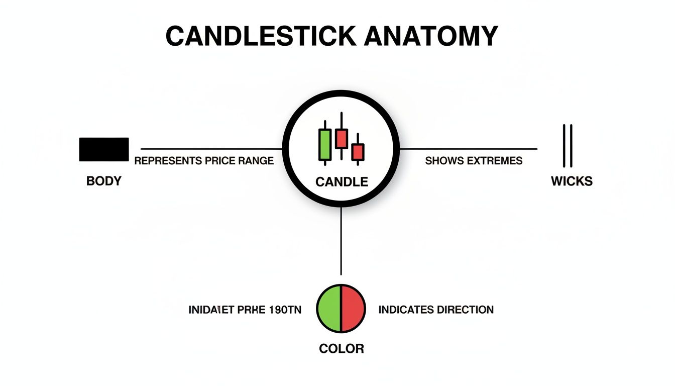
As you can see, the body, wicks, and color come together to tell a complete story about price movement. To build on these basics, be sure to check out our complete guide on how to read crypto charts for a much deeper dive.
Candlestick Components at a Glance
Here’s a quick reference table to keep the core components straight. Think of it as your cheat sheet for decoding any candle you see on a chart.
| Component | What It Represents |
|---|---|
| Body | The range between the open and close price, showing the net price change. |
| Wicks (Shadows) | The highest and lowest prices reached, indicating volatility and pressure. |
| Color (Green) | Bullish sentiment; the price closed higher than it opened. |
| Color (Red) | Bearish sentiment; the price closed lower than it opened. |
Start tracking smart money today
Join thousands of traders using WalletFinder.ai to find profitable wallets and copy their trades.
Start Free Trial →

